
Open any photography book, watch any tutorial, and within the first five minutes someone will mention the rule of thirds. It's the most taught composition principle in the history of the medium — and also the most misunderstood.
Here's the thing: the rule of thirds isn't really a rule. It's a default. It's a starting point that gets you 80% of the way to a balanced image without requiring you to think too hard. And that's both its greatest strength and its greatest limitation.
In this guide, we'll unpack what's actually happening when you place a subject on a third, why your eye finds it pleasing, and — most importantly — the specific situations where you should deliberately ignore it.
What the Rule Actually Says
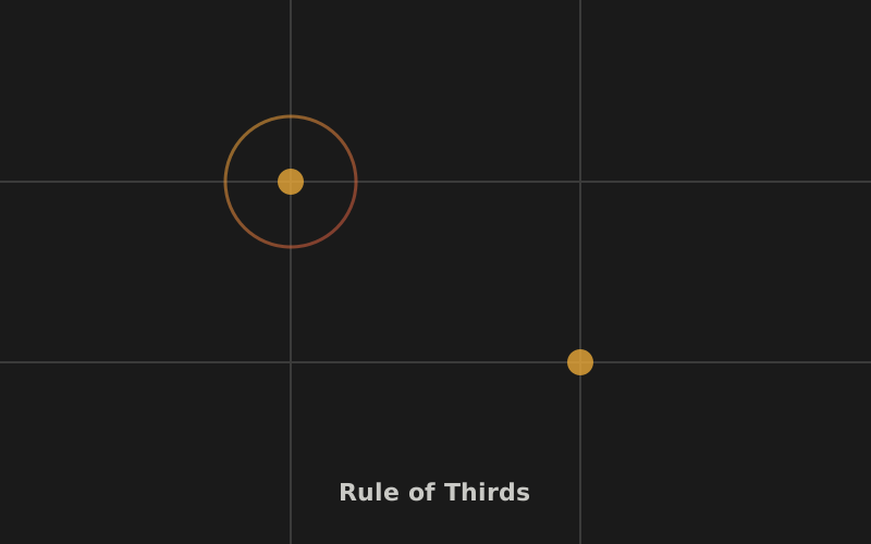
The rule of thirds is simple to describe: divide your frame into nine equal rectangles using two horizontal lines and two vertical lines. The four points where those lines intersect are called power points or intersection points. The guideline says: place your main subject or focal point on or near one of these intersections, rather than dead center.
Similarly, if you have strong horizontal or vertical elements in your scene — a horizon line, a building edge, a tree trunk — align them with one of the grid lines rather than bisecting the frame through the middle.
That's it. No math, no formulas. Just a grid and a suggestion about where to put things.
The Psychology: Why Your Eye Likes It
So why does this particular arrangement feel "right" to most viewers? The answer sits at the intersection of several psychological principles.
Asymmetry creates engagement. When a subject sits dead-center in a frame, the composition is symmetrical and balanced in a way that's immediately resolved. Your eye lands on the subject, confirms the balance, and has nowhere particular to go. There's no visual journey. Placing the subject off-center introduces a deliberate imbalance — the eye is drawn to the subject, but then it wants to explore the rest of the frame to understand the relationship between the subject and the negative space around it. That brief visual journey is what makes the image feel more dynamic.
The brain prefers off-center focus. Research in visual perception suggests that the human eye doesn't naturally fixate on the exact geometric center of a rectangle. We tend to scan slightly off-center, which means a subject placed on a third aligns more naturally with where our gaze already wants to land. The rule of thirds essentially works with your visual system rather than against it.
It implies direction and space. When you place a subject on the left third, the right two-thirds of the frame becomes space that the subject can "look into" or "move into." This creates a sense of narrative or potential movement. A portrait subject on the left third facing right feels like they have room to exist. The same subject placed on the right third facing right feels cramped, as if they're about to walk out of the frame — which can be intentional, but usually isn't.
The rule of thirds doesn't create great composition. It creates acceptable composition. The difference matters.
How to Actually Use It in Practice
Knowing the theory is one thing. Applying it while you're standing in front of a scene with a camera in your hands is another. Here's a practical workflow:
- Identify your main subject first. Before you think about the grid, ask yourself: what is this photo about? What's the single element the viewer should look at first? That's your focal point.
- Enable the grid overlay on your camera. Almost every digital camera and smartphone has a rule-of-thirds grid overlay in the viewfinder or screen. Turn it on. It's not cheating — it's a training tool.
- Position the subject on an intersection. Move yourself (not just the camera) until your subject sits near one of the four power points. You'll usually have two or three viable positions — pick the one that gives the subject space to "look into."
- Check your horizontals. If there's a horizon, put it on the upper third line (to emphasize the foreground) or the lower third line (to emphasize the sky). Rarely in the middle.
- Review and adjust. Take the shot, then look at it critically. Does the composition feel balanced? Is there distracting negative space? Move and try again.
Quick Tip
When shooting people or animals, place the subject's eye — not their head — on the intersection point. The eye is where viewers look first, so that's what should land on the power point.
When to Break the Rule
Now for the part most tutorials skip. The rule of thirds is a default, not a law. There are specific, recognizable situations where breaking it produces a stronger image than following it ever could.
1. When Symmetry Is the Point
If your scene is built around symmetry — a reflection in a still lake, a grand cathedral interior, a perfectly centered archway — putting the subject dead center amplifies that symmetry. The rule of thirds would actively weaken the image by breaking the mirror effect. Symmetry creates formality, grandeur, and a sense of order. Use it deliberately.
2. When You Want Confrontation or Intimacy
A portrait with the subject's face dead-center, filling the frame, creates a direct, confrontational connection between the subject and the viewer. There's no escape, no visual wandering. The viewer is forced to engage. This is why many powerful portrait photographers — think of intense character studies — abandon the thirds grid entirely for close-ups.
3. When the Subject Demands the Full Frame
If your subject is visually complex, textured, or detailed enough to fill the entire frame — a macro shot of an insect's wing, a weathered face, an architectural detail — centering it and letting it dominate makes sense. The rule of thirds assumes your subject is discrete enough to "place" somewhere. When the subject is the frame, placement becomes irrelevant.
4. When Leading Lines Do the Work
If you have strong leading lines guiding the eye through the frame, those lines may naturally pull the viewer to a point that isn't on a third. Trust the lines over the grid. Composition is about where the eye goes, and if the geometry of the scene already directs the eye powerfully, the rule of thirds becomes redundant.
5. When Negative Space Is the Subject
Sometimes the most powerful element in a photo is emptiness — a vast sky, a minimal seascape, a single figure lost in an enormous space. In these cases, you might place the figure at the very edge of the frame, far from any intersection, to maximize the feeling of isolation or scale. The rule of thirds would put the figure too close to center, killing the effect.
The Deeper Lesson
Here's what experienced photographers understand that beginners often miss: the rule of thirds is a training tool for developing your eye. It teaches you to think about placement, to consider negative space, to avoid the reflex of centering everything. But once your eye is trained, you graduate from it.
The photographers whose work feels effortlessly composed aren't mentally overlaying a grid on every scene. They've internalized the principles — balance, tension, visual flow, the relationship between subject and space — and they make compositional decisions based on what the specific scene demands.
So yes, learn the rule of thirds. Use it. It'll make your photos better immediately. But don't treat it as a ceiling. Treat it as a floor — the minimum viable composition that you build on as your eye develops.
For a deeper dive into more advanced framing approaches, explore our guide to composition beyond the rule of thirds, where we cover the golden ratio, diagonal lines, negative space, and frame-within-a-frame techniques.
Key Takeaways
- The rule of thirds works because asymmetry engages the eye and creates a visual journey through the frame.
- Place your subject's eye — not just their body — on or near an intersection point.
- Align horizons and strong lines with the grid lines, not the center.
- Break the rule when symmetry, intimacy, or strong leading lines call for it.
- The rule is a training tool — once your eye is trained, compose based on what the scene demands.
Keep Learning Composition
Composition is a skill you build one concept at a time. Explore our full composition guide hub for more techniques.
Browse Composition Guides