
If you've read our guide to the rule of thirds, you know it's a starting point — a reliable default that gets you to competent composition. But what happens when competent isn't enough? What happens when you want your images to feel deliberate, layered, and visually sophisticated?
You go past the rule of thirds. Not by abandoning it, but by adding a richer toolkit of compositional techniques that work alongside it. The rule of thirds tells you where to place a subject. Advanced composition tells you how to build an entire image — how to create depth, direct attention, balance visual weight, and make every element earn its place in the frame.
This guide covers six advanced framing techniques that experienced photographers use, often intuitively, to create images that feel intentional rather than merely well-organized.
1. The Golden Ratio and Golden Spiral
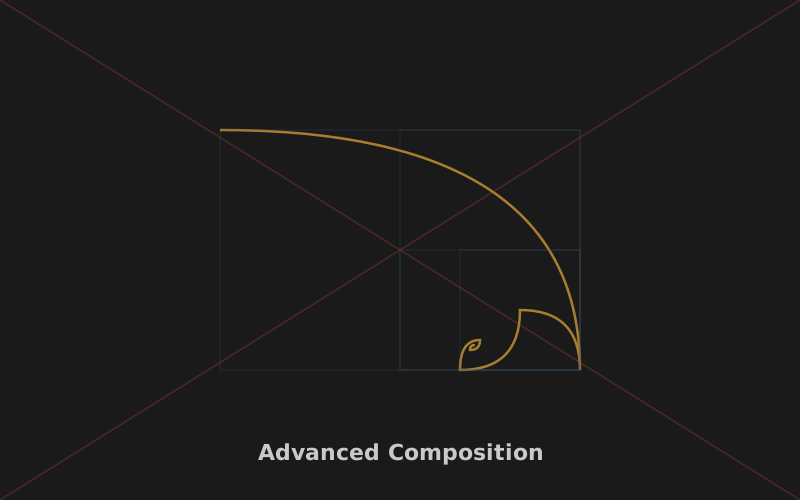
The golden ratio is a mathematical proportion (approximately 1:1.618) that appears throughout nature and has been used in art and architecture for millennia. In photography, it manifests as the golden spiral — a logarithmic spiral that starts at a point and expands outward, with the spiral's tightest curve being the natural focal point.
How does this differ from the rule of thirds? The rule of thirds divides the frame into equal thirds. The golden ratio divides it unequally — roughly 62% and 38% — which creates a different balance. The spiral leads the eye inward toward the focal point, creating a sense of flow and journey that the static thirds grid doesn't.
In practice, you can overlay a golden spiral on your frame (some cameras and editing apps offer this overlay) and position your main subject at the spiral's tightest point, with other elements following the curve. The effect is subtle but powerful — images composed this way often feel more organic and flowing than rule-of-thirds images, which can feel more geometric and static.
Many photographers use the golden ratio without knowing it — when a composition just "feels right" but doesn't fit the thirds grid, it often aligns with golden ratio proportions. Understanding the principle lets you use it deliberately.
2. Negative Space
Negative space is the empty area around your subject. Most beginners fill the frame with their subject, leaving little breathing room. Advanced photographers understand that empty space isn't absence — it's an active compositional element.
Used well, negative space:
- Emphasizes the subject by giving it room to stand out. A small bird in a vast sky draws the eye more powerfully than the same bird filling the frame.
- Creates mood. Large areas of negative space evoke feelings of isolation, freedom, minimalism, or contemplation. The subject feels small against the world.
- Provides balance. A subject on one side of the frame can be balanced by negative space on the other, creating tension that's more interesting than simple symmetry.
- Allows for text and graphics. If you're shooting for editorial or commercial use, negative space provides a natural area for text overlays.
The key to negative space is intention. Don't just leave the frame empty by accident — decide that the emptiness is part of the composition. A good test: if you cropped the image tighter and it lost something, the negative space was working.
Positive space is what you photograph. Negative space is how you feel about it.
3. Frame Within a Frame
This technique uses elements within your scene to create a secondary frame around your subject. A doorway, a window, an arch, the space between tree branches, a gap between buildings — any element that surrounds your subject creates a frame within the frame.
Why does this work? First, it creates depth. The frame element sits in the foreground, the subject in the middle ground, and the background behind — three distinct layers that give a two-dimensional image a three-dimensional feel. Second, it directs attention. The inner frame acts like a spotlight, isolating the subject from the surrounding scene and telling the viewer "look here." Third, it adds context. A subject framed by a doorway implies indoor-outdoor relationships; a subject framed by branches implies a natural setting.
Frames don't have to fully enclose the subject. A partial frame — a tree trunk on one side, an overhanging branch on top — can be just as effective as a complete one. The frame can also be out of focus, serving as a foreground blur that adds atmosphere without competing for attention.
To find frames, look for foreground elements that have gaps or openings: archways, windows, tunnels, bridges, gaps in fences, overhanging foliage. Position yourself so your subject appears through the gap, and compose to include the frame element at the edges of your image.
4. Diagonal Composition
We covered leading lines in a separate guide, but diagonals deserve special attention as an advanced technique. Diagonal lines create more energy and dynamism than horizontal or vertical lines because they imply movement and instability.
A diagonal running from bottom-left to top-right feels like upward movement — energetic and optimistic. A diagonal from top-left to bottom-right feels like descent — more somber or conclusive. These aren't absolute rules, but they're tendencies worth being aware of.
The most powerful diagonal in photography is the diagonal from corner to corner. When a strong line — a road, a bridge, a coastline, a shadow — runs from one corner of the frame to the opposite corner, it bisects the image into two triangles. This creates maximum visual tension and energy. The eye follows the line from corner to corner, traversing the entire image.
You can also use implied diagonals — lines suggested by the arrangement of elements rather than drawn explicitly. A series of objects arranged along a diagonal creates the same energy as a physical line, but more subtly. The eye connects them even though no continuous line exists.
5. Visual Weight and Balance
This is the most abstract and most powerful advanced concept. Every element in your frame has visual weight — a perceived "heaviness" that pulls the eye. Understanding visual weight lets you balance compositions the way a designer balances a layout, rather than relying on grids and rules.
What creates visual weight?
- Size: Larger elements weigh more than smaller ones.
- Position: Elements at the bottom of the frame feel heavier than those at the top (gravity). Elements on the right feel heavier than those on the left for most Western viewers (reading direction).
- Color: Warm colors (red, orange) feel heavier than cool colors (blue, green). Saturated colors feel heavier than muted ones.
- Contrast: High-contrast areas feel heavier than low-contrast areas. A bright spot in a dark image pulls the eye.
- Sharpness: Sharp areas feel heavier than blurred areas. This is why shallow depth of field works — the sharp subject has more visual weight than the blurry background.
- Faces and eyes: Humans are wired to look at faces. A small face in a large scene carries enormous visual weight.
Armed with this understanding, you can balance a composition like a scale. A large, heavy element on one side can be balanced by a small but visually intense element on the other — a tiny bright red bird balancing a large dark mountain. You can create intentional imbalance to generate tension, or careful balance to create harmony. The point is that you're making these decisions consciously.
The Master's Mindset
Advanced composition isn't about applying more rules. It's about developing sensitivity to visual relationships. Once you internalize these concepts, you stop thinking "where does the subject go on the grid?" and start thinking "how do all these elements relate to each other?" That shift — from placement to relationship — is what separates competent composition from art.
6. Layering and Depth
Photography flattens a three-dimensional world into two dimensions. Advanced photographers fight this flattening by creating layers — distinct planes of focus and content that simulate depth.
A layered image typically has three elements: a foreground (close to the camera), a middle ground (the main subject), and a background (the setting). Each layer adds information and depth. A landscape with wildflowers in the foreground, a lake in the middle ground, and mountains in the background feels three-dimensional in a way that a photo of the mountains alone does not.
Layering works best when each layer contributes something distinct. The foreground provides entry and context, the middle ground provides the subject, and the background provides atmosphere and scale. If the layers blend together — same color, same focus, same importance — the depth is lost.
You can enhance layering with depth of field. A slightly out-of-focus foreground adds depth without distraction. A sharply focused foreground, middle, and background (achieved with narrow aperture, as covered in our aperture guide) creates maximum depth from front to back. Choose your approach based on whether you want layers to separate or connect.
Putting It All Together
Here's the liberating truth about advanced composition: you don't use all these techniques in every photo. You develop a vocabulary of compositional tools, and you choose the ones that serve each specific scene. Some images call for negative space. Others call for layered depth. Others call for a diagonal bisecting the frame. The skill isn't in knowing all the techniques — it's in knowing which one each moment demands.
Here's a practice exercise: for your next ten photos, consciously choose one advanced technique for each. Frame one using negative space. Frame one using a frame-within-a-frame. Frame one along a diagonal. Frame one with layered depth. Force yourself to use each technique deliberately, and you'll start to feel when each one is the right call.
Over time, these techniques stop being techniques and become instinct. You won't think "I should use negative space here." You'll just compose with space, and later realize you used negative space well. That's the goal — not to apply rules, but to internalize principles until composition becomes as natural as breathing.
Composition is the most enduring skill in photography. Gear changes, editing styles come and go, but the ability to arrange elements in a frame for maximum impact is timeless. Invest in it. The rule of thirds is your foundation; these advanced techniques are your architecture. Build something worth looking at.
Key Takeaways
- The golden ratio offers a more organic alternative to the rule of thirds, with a spiral that leads the eye.
- Negative space is an active element — use it to emphasize subjects and create mood.
- Frame-within-a-frame adds depth and directs attention using foreground elements with gaps.
- Diagonal lines create energy; corner-to-corner diagonals create maximum visual tension.
- Visual weight (size, color, contrast, faces) lets you balance compositions beyond simple grids.
- Layering foreground, middle ground, and background restores three-dimensional depth.
Master the Full Composition Toolkit
These techniques work together. Explore our complete composition guide hub.
Browse Composition Guides