
You've seen those photographers whose entire feed has a consistent, recognizable look — warm and filmic, or cool and moody, or crisp and editorial. That's not luck, and it's not a single preset. It's color grading, and once you understand the framework, you can build your own signature look.
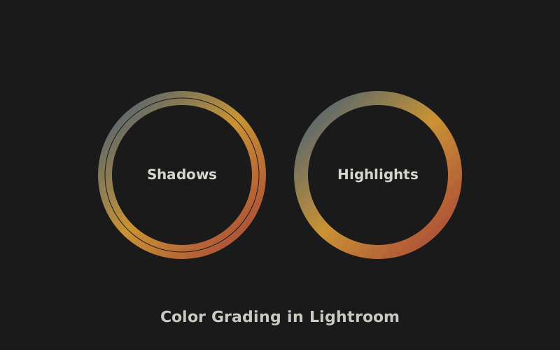
Color grading is the art of adjusting the color and tone of your photos to create a specific mood or aesthetic. It's different from color correction (which is about making colors accurate). Color grading is about making colors intentional — choosing a palette that serves the emotion of the image.
This guide assumes you're working in Lightroom Classic (or Camera Raw — the panels are identical) and that you're editing RAW files, which give you the latitude color grading requires. We'll build a repeatable framework you can apply to every photo, then customize for your style.
Before You Grade: The Correction Step
Color grading only works on a properly corrected image. If your white balance is off, your exposure is wrong, or your contrast is flat, grading will amplify problems rather than fix them. Before touching any color tools, do this:
- Set white balance. Use the eyedropper on a neutral gray or white area. Get the color temperature and tint accurate before you start creative adjustments.
- Set exposure. Use the Basic panel to get your overall brightness right. Don't worry about mood yet — just make sure highlights aren't blown and shadows aren't crushed.
- Set contrast. Use the Contrast slider or tone curve to establish a good baseline. A flat image can't be graded effectively; you need some contrast for color to have impact.
- Check your blacks and whites. Hold Alt (Windows) or Option (Mac) while dragging the Whites and Blacks sliders to see clipping. Set your white point and black point cleanly.
Once this foundation is solid, you're ready to grade.
The Color Grading Framework
Here's the repeatable process. Follow these steps in order, and you'll develop a consistent look every time.
Step 1: Decide Your Mood
Before moving a single slider, ask yourself: what feeling should this photo evoke? Warm and nostalgic? Cool and clinical? Moody and cinematic? Clean and bright? Your answer determines every decision that follows. Color grading without intention produces muddy, random results.
Write it down if it helps. "Warm golden afternoon, slightly faded, soft contrast." Now every slider move serves that vision.
Step 2: Work the Tone Curve First
The tone curve is the most powerful tool in Lightroom, and most beginners ignore it. The curve maps input tones (original brightness) to output tones (adjusted brightness). The bottom-left controls shadows, the top-right controls highlights, and the middle controls midtones.
For a warm, filmic look: lift the bottom of the curve slightly (this "lifts the blacks," giving a faded, matte appearance) and add a gentle S-curve in the middle for contrast. For a clean, modern look: keep the blacks deep and add contrast only in the midtones. For a moody look: pull down the midtones and lift just the very bottom slightly.
The tone curve shapes the emotional foundation. Get this right before touching color.
Color grading isn't about making photos colorful. It's about making color meaningful.
Step 3: Use the Color Grading Panel (Formerly Split Toning)
Lightroom's Color Grading panel (introduced in 2020, replacing the old Split Toning) is where the magic happens. It gives you three color wheels: Shadows, Midtones, and Highlights. Each lets you add a color tint to a specific tonal range.
Here's the framework that produces most professional-looking grades:
Complementary split: Add a warm color (amber/orange) to the highlights and a cool color (teal/blue) to the shadows. This is the classic "teal and orange" look that's ubiquitous in cinema, and it works because warm and cool colors create visual tension that feels dynamic and balanced. Use saturation around 15-25 — subtle enough that it doesn't scream "filtered."
Monochromatic warm: Add warm tones to both shadows and highlights (amber shadows, gold highlights) for a nostalgic, sun-soaked feel. Reduce overall saturation slightly so the warmth doesn't become overwhelming.
Cool and clean: Add subtle blue to highlights and leave shadows neutral for a crisp, editorial look. Pair with high contrast and deep blacks.
The key word is subtle. Beginners almost always overdo color grading. Start with saturation at 10, see how it looks, and add more only if needed. You can always increase; it's harder to pull back after you've committed.
Step 4: Refine with HSL
The HSL (Hue, Saturation, Luminance) panel lets you target specific colors individually. This is where you fine-tune your grade after the broad strokes. Common moves:
- Orange: Slightly reduce saturation and increase luminance for smoother, more flattering skin tones in portraits.
- Blue: Shift hue toward teal and increase saturation for punchy skies and water.
- Green: Shift hue toward yellow for warmer, more golden foliage, or toward blue-green for cooler, moodier landscapes.
- Yellow: Reduce saturation slightly to tame overly bright highlights in foliage.
HSL is where your personal style emerges. The exact adjustments you make to specific colors become your signature.
Step 5: Add Finishing Touches
Once your grade is in place, add these final touches:
Vignette: A subtle dark vignette (Amount -10 to -15) focuses attention toward the center and adds a finished quality. Post-crop vignettes only — don't apply before cropping.
Clarity and Texture: Use sparingly. Clarity adds midtone contrast that can look "crunchy" if overdone. Texture is gentler. For portraits, use negative clarity (+5 to -10) for softer skin. For landscapes, small amounts of positive clarity (10-20) add punch.
Dehaze: A magical slider that adds contrast and saturation specifically in hazy areas. Great for landscapes with atmospheric haze. Use in small amounts (5-15) — it can quickly look over-processed.
Sharpening and Noise Reduction: Apply output sharpening for screen or print. If you shot at high ISO, apply luminance noise reduction — but don't overdo it, or textures turn to plastic.
The Consistency Secret
Once you develop a look you love, save it as a preset. Then apply it as a starting point for every photo in a series, making small per-image adjustments. This is how photographers achieve a cohesive feed or a consistent gallery.
Common Grading Mistakes
Over-saturating. The most common beginner mistake. Vibrant doesn't mean better. Pull the overall Vibrance down by 5-10 and selectively boost colors you want to pop. Restraint reads as sophistication.
Inconsistent grading across a set. If you're editing a series — a wedding, a portfolio, a feed — every photo should feel like it belongs together. Use the same preset as a base and keep your adjustments within a similar range. A jarringly different grade on one photo breaks the set.
Ignoring skin tones. Your grade should flatter the people in your photos. If your teal-and-orange split makes skin look green or orange, dial it back. Use the adjustment brush to locally reduce the grade's effect on faces if needed.
Grading to hide bad photos. Color grading can't save a poorly composed or poorly exposed image. It enhances good photos; it doesn't rescue bad ones. Get the photo right in camera first. For more on that, see our exposure triangle guide and natural light guide.
Developing Your Signature Look
The goal of this framework isn't to make your photos look like everyone else's — it's to give you a repeatable process so you can discover and refine your own aesthetic. Here's how to develop a signature look:
Spend a month grading every photo with the same base preset, making only minor adjustments per image. At the end of the month, look at your work as a set. What do you notice? Are the colors consistent? Do certain adjustments recur? That pattern is the beginning of your style.
Then iterate. Push the look slightly warmer, or cooler, or more contrasty. See how it feels. Over time, you'll develop an instinct for the grade that feels like you — and you'll be able to apply it quickly and consistently across any set of photos.
Color grading is a skill, not a formula. The framework gives you structure; your eye gives you style. Use both, and your photos will develop a cohesion that immediately reads as intentional and professional.
Key Takeaways
- Always correct white balance and exposure before color grading — grading amplifies problems.
- Start with the tone curve to establish the emotional foundation of your grade.
- Use the Color Grading panel for complementary (warm highlights, cool shadows) or monochromatic splits.
- Refine specific colors with HSL — this is where your personal style emerges.
- Save your look as a preset and apply it consistently across photo sets for a cohesive signature.
Master the Full Workflow
Color grading is one part of post-processing. Explore our full editing guide library.
Browse Editing Guides